Redmarlin - Blog

How to survive in the internet ocean.
  • OctoberCMS - Relation lists with filters [HOWTO]

    In more advanced projects you will soon realize that relation lists/forms and in general the whole RelationController is lacking funcionality. One of those things that are missing are filters in the relation list. But fear not, you can render lists and forms manually and then you can add filters to it. The best place to start with manual lists are these two tutorials: https://octobercms.com/support/article/ob-21
    https://octobercms.com/support/article/ob-20

    But they only cover how to make a simple list rendered by hand in a partial and without filters. What I will cover in this article is how to do the same but using ListController (to render the list with filters for us automatically).

    Once you know the formula this is a pretty easy process. But I recon that getting there by yourself can be a painfull process (it was for me). After seeing the tutorial videos you would probably dive into the Behaviours and ListController to see how October does it because the documentation is still lacking. But it also has some good sides, you need to consciously code your plugins, you can't just paste random code form internet and make a plugin out of it. In other words, your code quality will be by default higher than code for other leading CMS platforms :)

    But let's get to the point. Let's say we have Order controller and model, then we have Product controller and model, both are glued together by Many to Many relationship with some pivot data. You will soon realize that when adding products to order manually (after reaching about 100 products) it gets really annoying to scroll through list of products to get those you want to add to order. Yeah you have search but sometimes you don't remeber the name, or you just want to browse given product category or color or anything like that. List filter would come handy here. Below are the steps needed to take to achieve that:

    1. Add custom button to relation toolbar to have Ajax handler that will render the custom list. We will remove the default Add Product button(rendered by RelationController) and put a custom Add Product button.
    2. We need custom Products list widget to display list of products
    3. We need to attach filter to Products list widget
    4. As an option we need to use a query scope to show, lets say only active products.

    STEP 1. Edit Controller/Orders/config_relation.yaml Your toolbarButtons declaration for products relation probably looks like that:

    
    toolbarButtons: add | remove
    
    Like I said before we want to use custom add button. Lets swap the default add button for a custom button. I will call it "productsadd" The line will look like this:
    
    toolbarButtons: productsadd | remove
    
    Now we need to put the code for the custom button somewhere, October is really making this easy for us. The only thing we need to do is to create a file called _relation_button_productsadd.htm in Controller/orders directory.

    This is how my file looks like:

    
    <button
    class="btn btn-secondary oc-icon-plus"
    data-control="popup"
    data-handler="onAddProduct"
    data-size="large">
    Add Product
    
    
    Two most important lines here are:
    
    data-control="popup"
    

    This will open the relation list in the modal window.

    
    data-handler="onAddProduct"
    

    This is our Ajax Handler to display custom list. We need to add a function in our Orders controller to handle it. Lets go to Controllers/Orders.php, but before we will add this action we should do some other things too. I will put it all in one file with comments explaning the lines of code we will add. Bear in mind that this is not the complete Orders.php controller file. Those are mostly only the lines of code you need to add.

    
    [...]
    # List and Filter widgets variables, name them as you want :)
    protected $productsListWidget;
    protected $productsFilterWidget;

    [...] public function construct() { parent::construct(); BackendMenu::setContext('Redmarlin.ShopClerk', 'Shop', 'Orders');

        #We need to create Products List Widget
        $this->productsListWidget = $this->createProductListWidget();
    }

    [...] # This is Ajax Handler invoked when clickin on "Add Product" button. What it does is to just assign # previously created widgets to variables that are accessible from partials.

    public function onAddProduct() {

        $this->vars['ProductListWidget'] = $this->ProductListWidget;
    
        #Variable necessary for the Filter funcionality
        $this->vars['ProductFilterWidget'] = $this->ProductFilterWidget;
    
        #Process the custom list partial, The name you choose here will be the partials file name
        return $this->makePartial('product_custom_list');
    
    }

    # Ahhh finally there, the most important part, here we declare all the necessary # things to make List widget with filters happen.

    protected function createProductListWidget () {
    
        #First we need config for the list, as described in video tutorials mentioned at the beginning.
        # Specify which list configuration file use for this list
        $config = $this->makeConfig('$/redmarlin/shopclerk/models/product/columns_relation.yaml');
    
        # Specify the List model
        $config->model = New \Redmarlin\ShopClerk\Models\Product ;
    
        # Lets configure some more things like report per page and lets show checkboxes on the list.
        # Most of the options mentioned in https://octobercms.com/docs/backend/lists#configuring-list # will work
        $config->recordsPerPage = '30';
        $config->showCheckboxes = 'true';
    
        # Here we will actually make the list using Lists Widget
        $widget_product = $this->makeWidget('Backend\Widgets\Lists', $config);
    
        #For the optional Step 4. Alter product list query before displaying it.
        # We will bind to list.extendQuery event and assign a function that should be executed to extend
        # the query (the function is defined in this very same controller file)
        $widget_product->bindEvent('list.extendQuery', function ($query) {
            $this->productExtendQuery($query);
        });
    
        # Step 3. The filter part, we must define the config, really similar to the Product list widget config
        # Filter configuration file
        $filterConfig = $this->makeConfig('$/redmarlin/shopclerk/models/product/filter_relation.yaml');
    
        # Use Filter widgets to make the widget and bind it to the controller
        $filterWidget = $this->makeWidget('Backend\Widgets\Filter', $filterConfig);
        $filterWidget->bindToController();
    
        # We need to bind to filter.update event in order to refresh the list after selecting 
        # the desired filters.
        $filterWidget->bindEvent('filter.update', function () use ($widget_product, $filterWidget) {
                return $widget_product->onRefresh();
            });
    
        #Finally we are attaching The Filter widget to the Product widget.
        $widget_product->addFilter([$filterWidget, 'applyAllScopesToQuery']);
    
        $this->productFilterWidget = $filterWidget;
    
        # Dont forget to bind the whole thing to the controller
        $widget_product->bindToController();
    
        #Return the prepared widget object
        return $widget_product;
    
    }
    
    # Function that will extend default Product query and only show active products 
    
         public function productExtendQuery($query)
    {
        $query->where('status','active');
    }


    That is basically all that is needed in the Orders controller. But we are still a few things short. We need a partial that we have declared in our Ajax Handler (onAddProduct) - "product_custom_list".

    Create a file _product_custom_list.htm in Controllers/orders/ directory. The code in this file is basically copied from the RelationController partial for managing pivot relation (modules/backend/behaviors/relationcontroller/partials/_manage_pivot.htm). If you need code for other relation type just copy appropriate file from RelationController dir and then modify it to suit your needs. In the first line, by using the data-request-data we are telling relation controller what relation we are displaying here. Apart from that we are rendering Filter and List widget.

    I have also customized a few other things here like: removed search widget and removed parts I wont use (ie the list will be always rendered with checkboxes).

    <div id="relationManagePopup" data-request-data="_relation_field: 'product'">
        <?= Form::open() ?>
            <div class="modal-header">
                <button type="button" class="close" data-dismiss="popup">×</button>
                <h4 class="modal-title">Product Selection List</h4>
            </div>
            <div class="list-flush">
                <?php if ($productFilterWidget): ?>
                    <?= $productFilterWidget->render() ?>
                <?php endif ?>
            </div>
    
            <?= $productListWidget->render() ?>
    
            <div class="modal-footer">
                <button
                        type="button"
                        class="btn btn-primary"
                        data-control="popup"
                        data-handler="onRelationManageAddPivot"
                        data-size="huge"
                        data-dismiss="popup"
                        data-stripe-load-indicator>
                        <?= e(trans('backend::lang.relation.add_selected')) ?>
                </button>
                <button
                    type="button"
                    class="btn btn-default"
                    data-dismiss="popup">
                    <?= e(trans('backend::lang.relation.cancel')) ?>
                </button>
            </div>
        <?= Form::close() ?>
    </div>
    <script>
        setTimeout(
                function(){ $('#relationManagePivotPopup input.form-control:first').focus() },
                310
        )
    </script>

    If you need search widget you need to add it the same way we added Filter widget.

    With this we can render Products list with working filters in the Orders update/create screen as relation. After choosing Product from the list a pivot create form will be shown.

    But there is still a tiny detail we should take care of. When using group type filter the dropdown list will be shown below our modal window. In other words it will be invisible!!! You can fix it with just one line of css. You need to change z-index of "control-popover" class to show it above the modal window. something like:

    
    div.control-popover {
    z-index: 9999;
    }
    
    will do. Then I simply injected css file from plugin/assets/backend_mods.css into Orders controller. But you can inject it globally in the Plugin.php. This way you don't need to add it in every controller.

    That's it, I hope you'll find this tutorial helpful. Let me know if I got something wrong or something is not clear enough.

  • - THE END -
  • OctoberCMS Leaflet.js map plugin

    OctoberCMS Leaflet map plugin Our new plugin has just been accepted on October marketplace.
    This time it is a simple plugin that lets you use Open Street Maps for example in your contact page and mark your location. This is an alternative for those that prefer open technologies.

    The plugin allows you to set coordinates for the map center, as well as zoom level. Additionaly you can place marker on the map and set a text that will be shown upon clicking on the marker.

    We have used leaflet.js library to interact with OpenStreet Maps. In the future we are planning to make possible choosing between various layers (ie. transport map, cyclist map, Questmaps, etc).

    You can read about technical aspects and installation guide of the plugin on October plugin page.

    You can also see source on Github.

    If you have any comments or proposals for improving this plugin contact us or leave us a comment.

    OctoberCMS leaflet map plugin

  • - THE END -
  • OctoberCMS - FAQ plugin

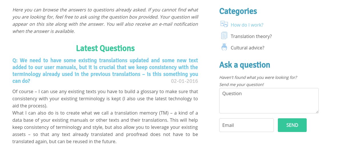
    Recently we worked with one of our clients on her new website and made a plugin to allow her visitors to ask FAQ questions directly on the site. We made it ourselves because there was no such tool for the platform – OctoberCMS (which should get its own post soon). The plugin we published on the October CMS page is a little bit diferent than the one we wrote for the client (as this is more custmized version for specific use).

    How It works

    The concept is simple. Visitor gets to FAQ section where he can see already answered questions divided into categories. If he can't find an answer for his question he can post it using a simple form.

    The site owner gets notified by email that a new question is being ask and is redirected to the control panel to reply the question. Once replied they can notify the visitor about the answer being published (if the visitor left his e-mail address).

    Why the idea?

    The purpose was to add some life and value for the visitors to a professional translator website. It has two main potential benefits:

    • By having the possibility to ask a question in FAQ section the visitors can interact in an easy and efficient way with the owner. It also makes the site more dynamic and interesting
    • On the other, hand the FAQ section will have the most usefull questions possible because those could be asked by actual potential clients.

    You can read about technical aspects and installation guide of the plugin on October plugin page.

    You can also see source on Github.

    If you have any comments or proposals for improving this plugin contact us or leave us a comment.

  • - THE END -
  • Back to Basics II - Non customer related functions of a website

    In part 1 of our series Back to Basics we talked about what the purpose of having a website is. In this part we'll concentrate on some aspects (goals) only briefly mentioned in part 1.

    So let's get started.

    While having a website to attract potential customers or directly sell your products is pretty obvious, there are two kind of goals that are almost forgotten:

    • To have a website to attract potential providers or other business related contacts (that are not clients) ie. hiring new employees

    • To have a website to improve internal processes, make your organization work and communicate better.

    I will now try to explain these two better and what it means for your business.

    Attracting potential providers and other business related contacts

    Let's say you want to have a website where you promote your brand and your products, so basically you are looking for new customers but at the same time, as new customers start to visit your website, also other people will do it for other purposes.

    Every day thousands of businesses are searching through the web to find (just like you ) new clients. And for some of those people YOU are their client. In other words there are providers from many industries looking for you. Having a website prepared also for them can help you engage with them and open new possibilities for your business. In many industries providers are crucial. For example in retail, where you basically resell products, contacting with new providers effortlessly can give you advantage over your competition because you will be able to give them more interesting products or a better price etc. Also having backup providers can be fundamental for making your business run smoothly.

    Even if providers are not very crucial for your activity, it is always a good thing to get in touch with potential new ones as this can lower your running costs (by finding ie cheaper providers for office products you use everyday), or make your processes easier (by being offered a software or solution that will agilize ie. processing payment from clients etc.).

    You will say, no big deal I can find them myself. But you are overlooking one crucial thing. It is very important to understand that normally, if you want to change a provider or look for new products or services you need it will cost you some effort and time to find those, communicate with them etc.

    But, oh irony, those companies you are looking for are at the same time looking for you, so why not just let them come to you in the way you like? If you don't need their services right now but you see that they offer interesting thing just save their address and contact details in your database or even in an email box. The additional advantage here is that you can be approached by companies you wouldn't be able to find yourself (because they are still young and don't score well in search engines or they don't have web page in your language yet by they do have sales staff that can communicate with you).

    A well crafted website can do that for you automatically, you just need to connect special contact form for providers with your CRM application or online store database or whatever you are using and it is set.

    Just as you have a contact form for clients in which you state in a few simple sentences why they should contact you, you could also have a contact form for providers in which you could state what services/products you are looking for and they will come, trust me :)

    And getting contacted by providers is just one example, this way you are able to make contacts with many different business globally which will have different relations with your company. You could find investors or new employees or opportunities to exchange information and experiences with other companies etc.

    In fact, using a website to attract potential employees is also an interesting feature. It can substantially ease your hiring process by selecting candidates on the page by using question forms or even better - challenges that the future employees need to clear in order to contact you and leave their CV or be qualified to have a meeting with your HR department.

    Actually, each of this uses is interesting on its own and deserves a separate blog post if not a book about how this goal should be achieved.

    How a website can agilize internal processes

    In a few simple words, you can "connect" your web page to any piece of software to make some tasks easier, faster or even totally automatized. One great example of such bundle is any e-commerce platform. On the visible side you have a store where customers can buy products and on the invisible (back-end only accessible for you or your employees) you have a system to automatically process payments, manage customer contact details, send automatic order status updates by email or even sms etc.

    It is just one example. Because posibillities are endless. You could "connect" your page with CRM software, to manage your potential customers and prepare marketing campaings or, like mentioned in the previous paragraph, have a website to recruit potential employees. You could also have, let's say, a real estate company website where you sell your properties and a backend that helps you keep track of new properties submissions, renting them, sales, etc. Then you can export all the data or prepare reports so you know what to change and what is doing well.

    When having many employees or branches, specifically prepared web portals can help you even further. Apart from a public visible web site, you can have a private portal (accessed with a passowrd or other security means) where you can exchange information and work in real time (using chat, advanced conferencing and virtual white board platforms) with teams from branches from other town, country or continent.

    The same can be done with specific groups of clients, for example manufacturing company could have a "client area" on a website for wholesellers or retailers where they can download product descriptions, photos (for promoting them in their stores), or resolve issues and questions with your staff.

    That leads to another example: a website that is made as a support platform for existing customers, be it live chat, simple question and answers page, ticketing system or closed forum.

    I could really go like that (almost) forever, but I think that you already got my point :)

    The possibilites of addressing those new goals, agilizing internal processes and bussines comunication with non-clients are endless. You just need to think outside of the box, you need to realize that a website can have many other purposes than attracting customers or direct sales. It can give you a lot more.

    What's more, if the website is well made you can extend its funcionality in any moment. Websites are powerful tolls for expanding your company if they are well and thoughtfuly made.

    Do you know any other examples of non customer related functions of a website? Share them in comments.

  • - THE END -
  • Don't write bad content, write good one!

    Think Sheep, Think!

    There are plenty of articles out there about writing perfect content for your blog or social network campaigns. They cover broad spectrum of problems and all of them promise you to be successful if following their rules. So why bother and write another one on the same subject? Well, because most of those mentioned articles are worthless. Yes, you read right. They are worthless. While some of the advice might actually work for someone, they won't work for the majority.

    As for why is this the case, the answer is really simple: because most of them are marketing gibberish and they don't take into account the real life. And there is also one important thing they won't mention (because they are meant to sell some ideas / products, not to help you cope with real life problems, and most of them are written with this annoying American rule – smile and pretend bad things don't exist) and this thing is LUCK. You can have the best content out there, written according to all those magic rules, have a perfect timing but still fail. Why? Because the world is a complicated place and human relations are even more chaotic. There are many unseen factors, many situations and many coincidences that can help promote your content or on the contrary bury it deep in the archives of internet.

    The great example would be your Facebook (or any other social network feed) wall. You have millions or posts of identical horribly sweet cat pictures but for some strange reason only few of them will get milions of likes or views. Of course SEO/marketing experts will tell you that this is because blablabla (put there a random set of rules you must follow when posting cat pictures) but the truth is that there is no correlation, there is no data to backup their statements. The answer is pure luck and coincidence! You cannot control or manipulate other people perfectly or totally. This world is not perfect.

    What is a good article

    Before going any further I would like to clarify one important thing: what I mean by a good article, perfect content etc. A good article is not necessarily an article written correctly (grammar-wise) or according to academic sentence construction rules, or that describes things helpful to others or explains how to do something well. No, all that doesn't matter. When I write those two words together, "good article", I think "something INTERESTING to read". It doesn't matter how it is written, about what, by who, but it must be a piece of text that is sucking you in, you don't want to stop reading it and when finishing you say to yourself that was something, I like it.

    Having said that, here at RedMarlin we have commited many mediocre texts, they are helpful, they even help solve important issues for our clients but they are dull. They are boring and grey, they doesn't have the spark. I really hope that at least this one will be different.

    Would writing this article mean a new start perhaps in quality of our posts? Well I can say one thing, dreaming is good thing but don't expect too much :P

    After this too long introduction lets start with the core of the article.

    Anybody can write, right?

    One of the most overlooked things in this whole writing bussines is that, contrary to what those "rules" suggest, not everybody is meant to write! I can't stress it enough, really. There are types of people that shouldn't write at all. It would be best for their bussines if they wouldn't write a single word, and I mean it. Many articles will try to convince you that it is easy, anybody can do that and similar stuff. But it is utterly false. There are people that are great speakers, they could convince a rock to throw itself into the ocean, but at the same time they suck at writng. So if you are one of them, don't write, get professional help (and I don't mean a doctor here, but a person that will write a blog or conduct social media campaign for you). Having said that, there are situations when you should write even if you are not good at it. But in such case, don't write an article, just a few words (and don't write a blog, please). Of course get it viewed by an expert and be sincere, state clearly that you don't know how to write and you won't write more than this. You could even admit that apart from those 2 sencences all other texts are written by a professional and not by you.

    It is about knowing yourself and being consious of your good and bad traits. It might not be easy but it will help you do better bussines.

    But enough of "bitching", don't feel discouraged, that doesn't mean you should stop writing or promoting your company (if you have some talent in this area). You should just make a concious choice and take the risk. You might get lucky, or you might not, but working hard makes your chances higher...Or not, you never know.

    But then...are there ANY rules you could follow to make your content better, make your chances higher?

    NO, there are NO fixed rules or dogmas on this matter. There is no easy fix-it-all solution. There are hovewer some hints and tips that could help you in some situations. But they are no magic chants. They won't cover up for your bad luck or convert a talentless graphoman into Sheakspeare. In the end writing is an art and you cannot constrain artist by some rules!

    First of all, you should use force... I mean, follow common sense, not things you read on the internet (including this article). You know, common sense, this forgotten something that most of the living human beings should possess naturally.

    The best article title ever?

    So don't name your article "10 Steps to Get Healthier", or "3 Ways to Solve Your Problems With Windows" just because somebody told you that using numbers and steps in title is a great way to promote your content. Think about it carefully. How many articles have you seen with numbers in the title lately? I would say way too much! How are you supposed to stand out if you are using a technique (and a cheap one at that) that 99% of other articles uses? Besides, this title forces you to make the article structure be divided in those steps, ways, rules etc. That makes them boring and sometimes unnecessary divisions for topics that don't need them. If things feel unnatural, you have less chances of getting to your readers.

    This applies to any title rule that will emerge eventually in the future. Just use a title that you like, don't listen to them!

    Write to your competition...ehm don't!

    Next thing you might want to consider when writing is to think WHO you are writing FOR. Should be obvious, but well, nowadays it isn't. Many of those bad mouthed articles in the beggining try to convince you that you should write to...guess who?

    COMPETITION. They advise you to write to the people and relate (on social media) with people that do the same. I mean, could anyone out there use common sense for once!? Internet is the same as real life. Being an apple seller, would you try to convince other apple sellers to buy your apples? Would you hang out with other apple sellers all the time in hope that they in future would purchase apples from you?

    Wasted effort. You should be relating and speaking to people that need apples, that are looking for this kind of food, etc. Selling sand on the desert, while not impossible (I'm sure that there are some sales representatives out there capable of doing that), is extremely hard and not really the smartest thing to do.

    So think who it is that you are writing for. Who your clients are. Don't write complicated technical stuff if you are not writing to your fellow engineers or doctors. Use language and style that is understandable.

    If you want to feel better and superior, then write for specialised magazines so other fellow whovever will understand you, but don't assume that it will bring you any customers. It will be just for your satisfaction or prestige, but not for your bussines.

    Besides,

    you need to know what your are writing about.

    Another obvious one.

    If you don't know what you are writing about, then again, don't write. Don't write about things you believe you should write about because apparently your potential readers need that or because it is trendy but you don't know a thing about it. You should write only about things that you do and like and have knowledge about. While reading articles nowadays, you get the impression that most of them are written because the wise marketing guy read that it is "trendy topic" which in normal life words means it is popular and fashionable. This is completly contraproductive. You will only harm your reputation and this will be a big stain on your shiny company badge.

    I really don't know what more could be said here. It is so simple and yet many fail here.

    You should write regularly?!

    This is a tricky one. Again, if you use common sense, it won't be so hard to figure this one right. There is a contradiction here: if you are a small bussines owner and you write to attract costumers and you succeed, then how are you suposed to write regularly? IF you have time to write very often, then obviously you don't have so many clients (this rule applies also to the author of this article). And when you have many clients, you don't have enough time and you stop writing. Unless you are a professional blogger or you have a dedicated staff at your company to write the stuff for you it is impossible to write regularly. Besides, it is often a fight between regularity and quality of your content. Ever read a crappy book written by a so called genius author? It happend to be crappy probably because after wrting his masterpiece the editor convinced him to write one book per year or even 2 books a year to earn more, to show the readers that you are alive and kicking and to have a constant flow of...well rubbish. It is not easy to write great content and it is even more difficult if you need to do it on a regular basis. Sometimes it is just better to write a short note to your faithful readers like, "sorry, too busy to write now becasue many clients are coming" or "I just can't make anything good right now, but I'm alive and well".

    Poor service/product with great content

    This one only seems simple. I guess I should say that even with great content you won't do much if you have poor services/product . But this is the case where common sense fail us. I have seen poor products that succeeded because of great marketing and content. What's more, they are still selling, they are worse than competition, they are poor quality, the are useless but they do have great advertisments and great content that attracts people to them constantly.

    So yay, I can sell anything as long as I have good marketing department, you could say. But there is bad news for you (I know you probably suspected it :) ). Those companies mentioned above are spending hudge sums to promote themselves and they need more and more promotion, they can't exist without increasing their promotional efforts. Without writing provoking articles, without having top quality content, it is getting harder for them to sell.

    Good products and services on the other hand, once they are decently promoted, will autopromote. So you write few good texts to attract the attention of the audience, and then the word of mouth is doing the job. In other words, if your service and product is good, writing your content (for promotional purposes, because there are people who write for fun ) will be easier for you.

    So you should probably stick to having great product and stop selling hair growing potions made of 100% water :)

    The one about visits

    Oh, this is my favorite one. The main holy grail of content writing and marketing in the internet in general are visits. The higher the number the better. Marketing experts will show you how succesful they are (and that's why you should listen to their phony advices) by shamelessly flashing thousands of visits in your face (supposingly, you owe all those visits to the fact that you followed their rules). What's more, they will guarantee that you will get even more visits by sticking even more to those rules. Sometimes they will even deliver what they promise. The problem is though that unless you are making money from showing ads on your site, visits don't mean so much. I mean decent level of visits is needed for your bussines to roll, but not the number but quality is what's important here. You need visits converted to customers or potetnial customers (which is nicely called conversions). Without that visits are not serving their purpose.

    Let's analyse this totally made-up example.

    You have written an article, with this (following the rules) flashy title, you used all the search engine optimalization tricks to make it score higher and to attract people's attention. And you are getting visits, tons of them. But no sales, no potential customers are coming, there is no engagement.

    Why? Because most of those visits last about 2 seconds for example, you managed to capture their attention by cool title but there is nothing to it, what's more, you've written it to your fellow apple sellers and you wrote about making a website (which you have no idea about). So your content really didn't connect, because how could it have done so?, with your audience. It was just another of thousands of mediocre articles in the net to promote oneself.

    Do you get what I'm trying to say here? Yes?!

    Good for you.

    No? Then there is no helping you, you are a strange being doing this strange thing called having different opinion. I just need to cope with that somehow.

    To wrap things up

    Now we are (finally!, I hear you shout) reaching the end, so I should sum things up. I really don't like this part. I'm actually really horrible at those things called introductions and endings. I just hope that this time our company' s main editor won't yell at me as much as she did last time (in fact, most of the introductions and summaries are written by her because I'm so unable to do it properly).

    Anyway, the main message here is: write good content, don't write bad content.... well the real main message here is start thinking by yourself when writing (and not only writing). But remember, writing is not for everyone and it is a tedious task and a lot of hard work, it is an ART. Not everyone can write good content, bear with it. But if you are decided and you have a clue or two how to write, well, then go for it and start thinking by yourself (yes I'm repeating myself on purpose), don't just listen to those internet experts! Forget all those strange advice, tips, rules they are trying to force on you, including this article. Don't stress so much about it, do it your way and maybe it will give you some pleasure sometimes (apart from new clients – hopefully).

    And now the most important part...

    Originally i wanted to say here that this article was written for money as a promotional material. But after a thought or two it didn't seem to be right. Because the truth is I can complain for free, for pure pleasure of doing it. I don't need any financial motive to critisize :)

    So this article was written out of pure desire to complain, nothing more nothing less. I hope you enjoyed it a little bit.

    That is all :)

    Actually, in case you haven't figured it out yet, we're much better at web design than...um...writing?

  • - THE END -
  • Opencart – How to hide or style Totals

    How to hide or style Totals in cart popup and checkout cart view – a tutorial for OpenCart 2.0

    At some point you might want to change how the totals are displayed across different sites in Opencart. For example, it is a good practice to make popup cart as simple as possible. For that, we would like to hide all the subtotal and tax fields. What you need there is just total of your cart.

    Opencart Hide Totals

    You cannot switch totals in the admin because they are needed for calculating the right final price, but how about just hiding them in the theme styles so that they don’t apear on the page but are stil calculated. There is a problem with that, there is no css id nor style that makes it possible to distingush between different totals in Opencart. They are just fields in a table.

    So what we would like do is to distinguish those table rows in some way.
    There are many ways to acomplish this task but what we did is to add special class to each row depending on total code.
    The modifications are really minimal. Just a few lines of code and you are done.
    In our approach we use a code value from the total arrays (see this file catalog->model->total->totals.php) This value is set for each total defined in the OC admin. It will be:

    • sub_total for sub totals
    • tax for the tax ammount
    • shipping for shipping totals
      etc.

    It is very handy as it lets us distinguish perfectly between totals and hide what we don’t need. We should modify 3 core files to enable this value for use in templates. If you don’t like – just like us – modifying core files, just use vqmod to do so.

    Download totals modification vqmod for OC 2.0

    This mod will take care of core files code only. You need to make template modifications by hand. Why?
    Because we don’t think using vqmod for template files is a good thing. Templates system is designed to be modifed directily, without the use of vqmod. And it would be better to do it this way as many themes change template files drastically or overide default template settings. So in many situations vqmod with templates simply won’t work or will mess up your template.

    If you use this mode you can skip steps no.1 and 2 for each page but you still need do do the third step to make this work.

    If you have any problems with installing those modules or you need professional help with customizing your OpenCart

    Contact us for a free consultation or quote

    This is a tutorial for OpenCart 2.0 showing how to enable Total identification to be able to hide subtotals or make it bigger or smaller, according to the importance of the information.

    If you need to modify totals on just one page just do one step (I, II, III) accordingly, each step is for different page, so you don’t need to do all the steps if you don’t need them.
    The procedure is almost indentical for all those 3 pages.

    I. OC 2.0 Cart popup totals

    1. Edit file catalog->controller->common->cart.php
      Find line:

       text'  => $this->currency->format($result['value']), 
      and after this line add:
       'code' => $result['code'],  
      This will enable the variable code in our totals array.

    2. Edit file catalog->view->themes->YOUR_THEME->templates->common->cart.tpl
      Look for line (near the end of the file)

      <?php foreach ($totals as $total) { ?>

      below you should have this line:
       <tr> 
      This line below, depending on your theme, could also be “ul” or “li”
      It doesn’t matter what it is, just add to it – just before the ending > – this text:
      id="popuptotals<?php echo $total['code']; ?>"

      So it will look like
      <tr id="popup_totals_<?php echo $total['code']; ?>">
      or
      <ul class="popup_totals_<?php echo $total['code']; ?>">
      or whatever it was before.
      That will set a special css class with different name for each subtotal so it will be easy to change its style or hide it.

    3. Now go to catalog->view->themes->YOUR_THEME->stylesheet->stylesheet.css
      and depending on what you want to do, add a code styling different subtotals.
      For example, in order to hide tax and subtotal and only show total(like in the picture below), paste this code
      #popup_totals_tax, #popup_totals_sub_total { display: none; }

    Opencart Sub Total hidden

    If you want to change totals size to make subtotals different size than total paste this code:

    #popup_totals_tax, popup_totals_sub_total {
    font-size: 12px;
    }
    

    Change 12px to whatever size you want them be, and so on.

    II. OC Checkout shopping cart

    1. Edit file catalog->controller->checkout->cart.php
      Find line:

      text' => $this->currency->format($result['value'])
      at the end of this line add a comma so it would look like:
      text' => $this->currency->format($result['value']),
      and after this line add:
      'code' => $result['code'],

    2. Edit file catalog->view->themes->YOUR_THEME->templates->checkout->cart.tpl
      Look for line (near the end of the file)

      <?php foreach ($totals as $total) { ?>
      below you should have this line:
      <tr>
      This line below depending on your theme could also be “ul” or “li”
      It doesn’t matter what it is, just add to it – just before the ending > – this text:
      id="checkouttotals<?php echo $total['code']; ?>"

      So it will look like
      <tr id="checkout_totals_<?php echo $total['code']; ?>">

      or
      <ul id="checkout_totals_<?php echo $total['code']; ?>">
      or whatever it was before. That will set a special css class with different name for each subtotal so it will be easy to change its style or hide it.

    3. Now go to catalog->view->themes->YOUR_THEME->stylesheet->stylesheet.css
      and depending on what you want to do, add a code styling different subtotals. For example to hide tax and subtotal and only show total paste this code
      #checkout_totals_tax, #checkout_totals_sub_total { display: none; }
      If you want to change totals size to make subtotals different size(like in the picture below) than total paste this code:
      #checkout_totals_tax, checkout_totals_sub_total { font-size: 12px; }
      Change 12px to whatever size you want them be, and so on. Opencart Cart hide subtotals

    III. Opencart 2.0 Checkout Confirm page totals

    1. Edit file catalog->controller->checkout->confirm.php
      Find line:

      text' => $this->currency->format($result['value']),
      and after this line add:
      'code' => $result['code'],

    2. Edit file catalog->view->themes->YOUR_THEME->templates->checkout->confirm.tpl
      Look for line (near the end of the file)
      <?php foreach ($totals as $total) { ?>
      below you should have this line:
      <tr>
      This line below depending on your theme could also be “ul” or “li”
      It doesn’t matter what it is, just add to it – just before the ending > – this text:
      id="confirmtotals<?php echo $total['code']; ?>"
      So it will look like
      <tr id="confirm_totals_<?php echo $total['code']; ?>">
      or
      <ul id="confirm_totals_<?php echo $total['code']; ?>">
      or whatever it was before.
      That will set a special css class with different name for each subtotal so it will be easy to change its style or hide it.
    3. Now go to catalog->view->themes->YOUR_THEME->stylesheet->stylesheet.css
      and depending on what you want to do, add a code styling different subtotals.
      For example, in order to hide tax and subtotal and only show total, paste this code
      #confirm_totals_tax, #confirm_totals_sub_total { display: none; }
      If you want to change Total size to make it bigger than subtotals and to be in red paste this code:
      #confirm_totals_total { font-size: 12px; color: #FF0000; }
      Change 12px to whatever size you want it to be.

    And that’s it! I hope you’ll find this step-by-step tutorial easy to follow. Let me know if you have any problems. Good luck!

    If you have any problems with OpenCart and need professional help or support

    Contact us for a free consultation or quote

  • - THE END -
  • Mobile design and Google search results

    Being mobile ready can affect positively your SEO

    The mobile web market is growing amazingly fast and website owners try to go ahead and adapt their sites for mobile users. But in the near future being mobile reday won’t mean being ahead, it will be simply essential for your web presence. Well, in fact it is already happening, you don’t have to wait for the future. Mostly because you need to be able to serve new customers, but there is also another aspect of being mobile friendly which is often overlooked and can be crucial for your bussines. Being mobile friendly directly affects your position in Google searches (SEO).

    In November 2014 Google announced that it will add a special tag to all websites adapted to mobiles, a “Mobile-friendly” label.

    Google Official Blog

    Google mobile search 
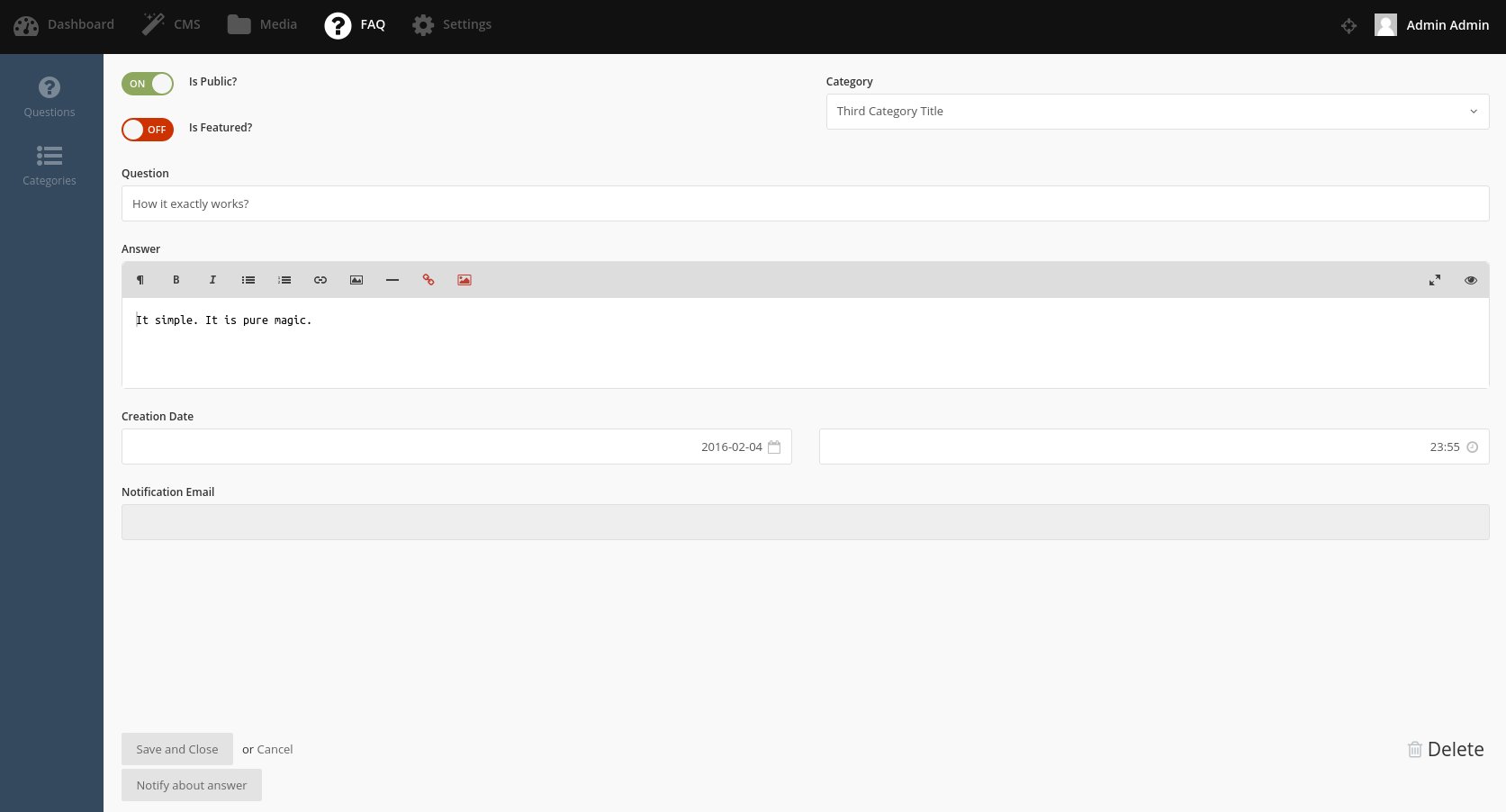
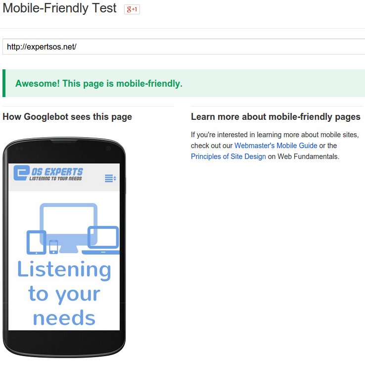
Source: Google Official Blog

    But that’s not all, Google is experimenting with using mobile-friendly criteria to rank your site. In other words, being mobile-friendly will affect your google search ranking.

    According to Google, a webpage is eligible for this label if it meets the following requirements:

    -” Avoids software that is not common on mobile devices, like Flash”

    – “Uses text that is readable without zooming”

    – “Sizes content to the screen so users don’t have to scroll horizontally or zoom”

    – “Places links far enough apart so that the correct one can be easily tapped”

    Google also provides site owners with a tool where you can check if your site is currently meeting those conditions.

    Google Mobile-Frinedly Test

    Google Optimization tool

    If your site is mobile friendly then you will see green texts saying everything is OK*like on the pic above). If not you will receive some tips how to make your site better.

    The speed IS important

    There are many articles stressing the importance of speed in web design, especially in mobile world. Google also takes that into account (this mechanism is already implemented into Google algorythm) in its ranking mechanism. Pages that open faster and are better optimized will score higher in Google searches.

    Again, there is a tool from Google to check how your page is doing in terms of optimization, user experience and speed. It is a good thing to score high, but you don’t need to worry too much about all the tips and fixes proposed by Google. Those certainly will make your site Google bot friendly but it will sometimes hinder the user experience which is by far the most important thing.

    Google mobile ready test

    As a general rule, it is good to score in green range of points (aprox. 90 out of 100) to make sure it will affect your GOOGLE SEO positively.

    Google Speed Insights

    Also it is a good habit to compare Google test results with other tools of this type, just to name a few that are the most usefull:

    Pingdom
    Web Page Test
    GT Metrix

    Choose your developer carefully

    I will use a short Google article about making better mobile ready websites as a pretext to highlight 2 important aspects of web designing. One of those articles has 6 pieces of advice for finding a good developer to ensure high quality and mobile readiness of a site.

    What should I think about when working with a developer – by GOOGLE

    Most of the tips are nothing new and are really common sense, like: make sure to hire a developer with experience in mobile web design, make sure he understands mobile world, make him install measurement and analitics tools etc.

    But there are two points that are the most important. Google doesn’t enter deep into the subject so I would like to explain those 2 concepts mentioned by Google a little bit more (points 3 and 6 of the above-linked article).

    Google developer guides 
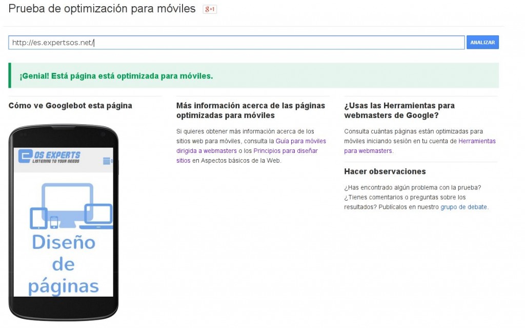
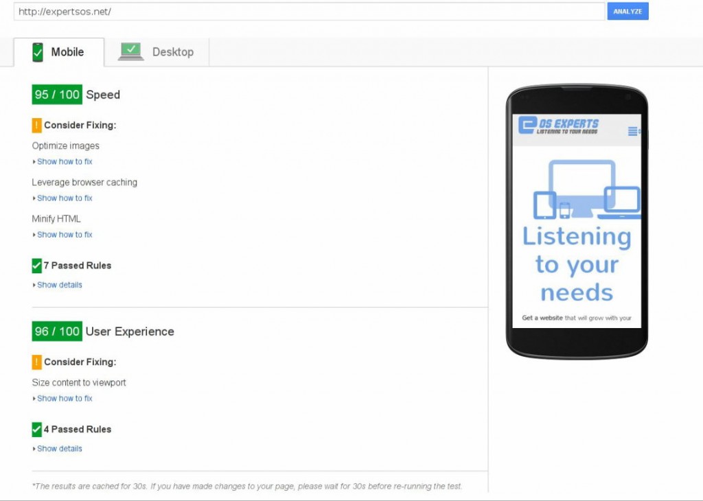
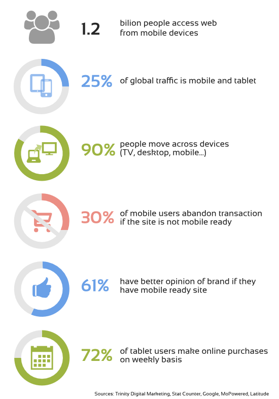
Source: Google Site Insights

    Web page speed is crucial, not only for your SEO ranking.

    Developers are often so concerned about the design, look and feel of the pagethat they tend to completely forget that SPEED is a very important part of user experience. If the page doesn’t open fast enough, all those bells and whistles won’t serve their purpose. The visitor, discouraged by how slow the site opens, will leave even before trying or seeing them.

    So yes, speed is important and make sure that the team your are hiring not only has a developer who can make fast and optimalized web apps, but also a good sysadmin that can tune the server to ensure a maximum performance for this specific web page.

    The site is not a finished product, it needs to evolve constantly.

    While speeding up the websites is gaining more and more supporters and many articles have been written about it recently, this aspect remains rather unknown to the general public. In a world where technology changes so quickly, there is no such thing as 100% complete/finished web page. A web page is not a book that, once finished, you can put on display and forget about it. Websites need to be constantly adapted to changing technologies, user needs and expectations.

    That’s why it is important to listen to your customers and analize web page statistics. You should CONsTANTLY IMPROVE your web page in order to deliver the best experience possible. Don’t forget that in many cases your company’s web page is the first encounter point for your clients. They will get to know you by your web page, they will judge your bussines by how your page works and how it looks.

    Besides, manitaining and upgrading web pages on a regular basis makes it easier, faster and less expensive to adapt to a constantly changing world. It is better to give one small step at a time than to have rebuild your web site every few years from scratch, and it gives you a website that is always up-to-date, not only every now and then.

    Listening and taking your clients’ feedback into account will not only let you make the web page a better experience for them, discover their needs or anticipate the market demand, it will also cause you’ll be closer to your customers, it will help engage with them and build a community around your business.

    To sum up, being mobile friendly is a must-be for any company now, as not only will it reach customers using mobile devices but it will also add “points” to your Google search ranking. Besides, being mobile means being FAST – optimizing your site for speed is as important as having great responsive design, or even more important. You also should not forget that a website is not a finished product and it should constantly evolve to match your client changing preferences.

    If you need a mobile friendly website/online store that is optimized for speed Contact us for a free quote

    What’s more, it looks like our own philosophy of constantly growing websites matches perfectly Google tips for site owners!

  • - THE END -
  • Opencart 1.5 File too big error – fix

    Max file size you can upload in OpenCart 1.5 admin is 300Kb. But sometimes you need to upload bigger images. What then? If you get this message while trying to upload images / files then it’s time to make some changes.

    “Warning: File too big please keep below 300Kb and no more than 1000px height or width”

    Opencart 1.5 File too big error message

    The fix for that is really easy and doesn’t require a lot of changes to be made. To edit manually, follow the instructions below (in TUTORIAL chapter)

    If you don’t want to do it manually, as always we provide vqmod that will change it for you automatically. It will change the max file size to 10Mb.

    Just download this file Opencart 1.5 file too big fix (Vqmod)

    unzip it and upload it to vqmod/xml directory :)
    Remember to use this module you need to have VQMOD installed.

    How to change Opencart 1.5 image size limit – Tutorial

    1.Go to you OpenCart installation dir and then edit this file:
    admin/controller/common/filemanager.php

    2.Find those 3 lines:

    if ($this->request->files['image']['size'] > 300000) {
    $json['error'] = $this->language->get('error_file_size');
    }

    3.Now you have 2 options: Remove the limit completely or change it to something usable like 5mb or 10mb.

    3A.Variant one (removing the limit): to do that, just add at the beginning of each line # sign, so the code will look like that:

    #if ($this->request->files['image']['size'] > 300000) {
    #$json['error'] = $this->language->get('error_file_size');
    #}
    

    That’s it.

    3B.If you want to change the limit, then edit the first line and change 300000 to any value you want (for 5mb it will be 5000000 and for 10mb 10000000) The first line should look like this:

    if ($this->request->files['image']['size'] > 5000000) {
    And basically, that’s the whole solution.

    If you have any questions or problems just ask in the comments :)

    Share this article if you liked it and it solved your problem.

  • - THE END -
  • Back to Basics - A purpose of a website

    What is a purpose of a website?

    What is a webpage for? (What’s the goal of having a webpage?)

    With this article, I would like to start a cycle called Back to Basics. Its purpose it to make us think about things we take for granted in web design for business, but that sometimes are just plain myths, and in other cases those things are not so obvious as we might think.
    In this cycle we will basically cover the following topic: what makes a website a successful website. What are the ingredients needed for a good website?

    So what is a webpage for? Does it need to have any purpose?

    YES, it does. That is a necessary element of every successful web page. It needs to have a purpose. Many webpages fail because its purposes haven’t been reflected upon during the design stage nor anybody thought about them afterwards.

    What’s more, answering this question is really answering another one: Do I really need a website?!

    I hear you screaming, “we live in XXI century!. Everybody needs a web site. I need a website because my competition has one.” Well, that’s not true. Even the statement that everybody needs a web presence is not true! Those are myths. There are businesses or targets that do not require a website. Sometimes just being listed in Yellow Pages does the job better than any webpage. But you won’t hear it from most of web designers out there :) If you are unable to maintain the web page actively or develop it constantly, there is no meaning in having a web page. Because it will not fulfill any of the aimed goals.

    Getting back to the main question: most of the answers you will give to the question about the purpose of your site can be closed in one sentence.A sucessful website needs to add some value to your business and it can achieve it in 6 main ways which can overlap with each other.

    • Building Brand Awareness – to promote your brand and make it recognizable

    • Building a community of potential clients around your page to attract potential customers

    • Being a communication channel for promotions, activities, events

    • Selling your product / service directly – another sale channel for your business

    • New business contacts – getting in contact with providers and other businesses that are not your clients or hiring new staff

    • Making your internal processes easier – internal portal to work with employees in different locations, coordinate different branches, having online CRM system or even customer service website.

    6 main goals of a company website

    I would like to explain the 2 last points in the second part of Back to basics series as those goals are almost forgotten and often overlooked. Please stay tuned, part 2 coming soon!

    Having nailed those 6 main ways to add value to your business by having a website brings us down to one thing. It is all (perhaps except for the 2 last ) about direct relation with customers and potential customers. A website is a kind of a middle man between a company and people interested in their services / product.

    In other words, a website is a gateway for your company to direct interaction with potential clients.

    So the common sense will tell us that the whole process of designing and having a web page should be client-centric. Yet sadly in many cases it is totally the opposite.

    It is often company-centric. We want to promote our company’s image by using techniques we (as business owners) like and are used to. On the other hand, web pages are seldom agency / designer-centric. The designer wants to show off his style and knowledge. The most beautiful colours get combined with astonishing web interface and many photos, etc.

    Amidst all this, the main hero of any web page – the VISITOR – gets forgotten. The most important thing of a web site is USER FRIENDLINESS. To let the user make things the way they like, and not to hide important (to the client, not to the company) information behind many subpages and clicks. Clean and intuitive design is key here, as well as well programmed and planned base for the engine serving the web site. It needs to be functional and practical.

    So you could ask, how should I know what the client wants, how he moves around the web page, what is a hindrance for him. Well, there is a really easy answer to this question.

    Ask them! Modern technology gives us multiple and effective ways to communicate and interact with web visitors. I would like to cover them in detail in the next part of the series of getting to the basics, but I will just name them here:

    direct website survey, ask your followers on social networks, analyze your site visit statistics, analyze your site keywords, analyze what visitors are doing on the page, etc.

    To sum up

    The first ingredient needed for a good website is to have a goal. A website needs to have a clear goal. What’s more, it needs to be designed and maintained according to this goal. And last but not least, it needs to be client-centric.

  • - THE END -
  • Responsive design optimization

    Is my site really mobile ready?

    Amidst all this technological turmoil, many people tend to think, “well, I have my responsive web page finished, so I guess I am mobile ready?” Well, probably not yet. The thing is, most designers forget about one “small” detail – performance. Usually, the biggest flaw of responsive design is its speed. Here goes an attempt to explain this aspect without entering too much into tech details.

    In responsive design, you scale elements (including images) on browser screen to match users device size. But this doesn’t mean you actually make big image any smaller. What this scaling does (the scaling is mostly done in CSS) is to take the original image and tell the browser to show it as a smaller image. What it means is:

    optimalize1

    This way, if you have a big image to match large desktop screen, this image will be loaded by mobile devices also, it will just appear smaller. The bigger the image, the slower it will take to load it. And on mobile devices it will make even longer, as those normally have much slower internet connection than your laptop or desktop pc. Apart form images, there are lots of other elements that are loaded to make the page look nice. Those elements are sometimes hidden by responsive design for smaller screens because they are not needed or they just use too much screen. But like with images, they are still loaded by mobile users, even if they are not displayed.

    Well nobody likes to wait, so if the visitors are forced to wait too long, they will probably leave the site. Also, if the site is too big while having many visitors per hour, it may significantly slower your server, and consequently your web page, even more. In other words, websites that suppose to be mobile friendly don’t serve their purpose if they load too long. Optimization for speed is a must-be in the small screen size world.

    Is there anything we can do about it?

    The answer is, of course, yes. There are a few ways to optimize responsive design pages. Apart of course from doing nothing (which is sadly the most common approach).

    There are also some basic things you should always do independently whether you deal with responsive designs or not.

    • Compress all your images so that their size will decrease, which means loading faster and using less server bandwidth.Use services like:
      Compressor.io
      Kraken.io

    • Think whether you really need all of those bells and whistles, turn off all those functionalities you don’t need or you don’t use right now.

    • Use plugins for your CMS or online shop that will optimize your content. Normally what they do is to compress content they send to visitors so that it takes less to send it. They also cache content (save most used parts of your web page and serves it in more efficient way). There are many of them available for any platform. Just to name few plugins for WP: APC, W3 Total Cache or WP Super Cache

    There are also some more advanced techniques to optimize your web page. All of them have one thing in common: detecting visitors screen size and serving resized(smaller) and optimized images for this screen. As it usually happens, most of those solutions are not perfect. So the best approach is to use multilevel optimization or mixed techniques to get a final effect as foolproof as possible.

    Just before ordering your web page, make sure that your designer understands the need of optimization or – even better – that the company you hire has a server administrator capable of tuning your server and website for faster mobile experience.

    Advanced responsive design optimization solutions.

    If you are not scared of technical details I will name 3 mainly used methods of advanced responsive design optimization.

    • Javascript optimization.
      This will use some special written code (javascript) to detect visitors settings and then on the fly overrides big images with their smaller versions.
      While it can detect various different settings, this approach sometimes tends to fail to optimize anything. Because modern browsers fetch images before they execute java scripts, chances are that you will force visitors to download the same image twice (first the big version and then the small version), this is not what we really want, is it?
      There are many new variations of this method appearing that try to address the problem, so these solutions are starting to work better, but still they are fair less effective than server side optimization. The biggest advantages of this solution are easiness of implementation and possibility of detecting many other settings than just screen size.

    • Server side optimization.
      This will use special server configuration to detect the browser version of the visitor and see if this is mobile, tablet or desktop. Then it directly serves appropriate version of the image. This method is very fast and the gains in performance are really big but it fails to detect many devices and you need to constantly add new browser versions. Also it is unable to detect visitors screen sizes. It can only detect if its mobile, tablet or desktop and even here it can fail sometimes.
      (Well, to be honest. there are high-end server detection systems with device database constantly updated but they are very expensive and are normally directed to corporations or big companies). So this approach will require deep server knowledge and thus it will be more expensive to setup and maintain. But this is the option that gives the highest speed increments.

    • The best of the two worlds.
      This approach mixes the js detection possibilities with server side optimization. Basically, the javascript is responsible for detecting the screen size and then communicating it to the server (using special cookie), the server then recognizes the cookie and serves images accordingly to the screen size. It also has a fail-safe mechanism: if by some reason the cookie is not set fast enough for the server to react, there is a server level device detection (although not perfect, it will be enough as a backup mechanism) and will try to serve image accordingly to the system detected (mobile, desktop or tablet).
      This will give you both the flexibility of visitors settings you can detect and the speed of server side optimization.
      Of course, even this system can sometimes fail to detect the visitor’s screen size accurately, but because of the double check the chances are much smaller.
      You would still need a system administrator to setup the server for this solution and you’d have some maintenance costs, but those would be lower than in case of pure server side optimization.

    By far this third option is the best solution to implement, and the most cost effective.

    To sum up

    Responsive design is a must-have these days, but only if properly set up. Choose the option that is best for you and make sure your designer understands this issue and takes it seriously.

  • - THE END -
  • A follow up on Google mobile friendly ranking change

    Here is a follow-up on Google new mobile-friendly algorithm that will roll out on April 21.

    Few days a go (on Wednesday, March 24) Google hosted a hangout on their official Google webmasters page. Google shed some light or better said clarified some points about new algorithm’s implementation planned on April 21.

    First of all, they confirmed that the update will affect all languages, but the changes won’t be global immediately. To update all languages it will take a few days to a week.

    Google also confirmed that this is an important update and a significant ranking change. But this change wont affect desktop users. It will only be applied to searches conducted from mobile phones.

    But taking into account that mobile traffic is about 30% of all global internet traffic and that users often enter from their mobile phone and then switch to desktop if they like the site or online shop, you can’t really just ignore this change or care only about desktop anymore.

    As for the mobile-friendliness factor, there won’t be any page rank points for being more mobile friendly than others. Either you are mobile friendly (and score higher in mobile searches) or you are not mobile friendly (and score lower). Also the algorithm will check page by page on your site and each mobile-friendly page will receive a badge and score higher. It is not site based but page based.

    People from Google webmaster department also confirmed once again and named all the things you need to do to be mobile friendly.Those guidelines are numbered on their Mobile-friendliness test tool and the general rule is that if the page gets the green light in this tool it is prepared for the algorithm change. So if you get a green light in this tool you are OK.

    A list of those mobile friendly factors that Google will have in mind for giving you mobile-friendly badge as stated during hangout are:

    – Are all links well separated so that clicking on them is easy?

    – Is your font size big enough to read comfortably on small devices?

    – Is your page width adapted to mobile device screen (that means no zooming or horizontal scrolling to use the page)?

    – Is your page using technology not supported on many mobile devices (flash is a big no-no)?

    As a side note here, Google confirmed that it is using the speed of site opening as a ranking factor from some time now as this is one of the crucial factors for being mobile and in general visitor friendly.

    Google webmaster department staff also stressed out during their hangout that the most important thing is to be user friendly, think about usability and have an up-to-date site, then you don’t need to worry about algorithm updates – neither this one nor the future ones as Google always strives to promote sites that are user friendly and easily usable and that users will love. Well, this is not always true as Google sometimes arbitrarily picks controversial factors for their pager ranking mechanism. But as a general rule, if your site is made with its visitors in mind (and well prepared for all different devices) you shouldn’t have major problems with new Google ranking mechanism.

    When talking about usability, it is good to mention that while Google denied that in the coming algorithm change they will penalize pages that have annoying features for users like whole page adds popups or videos that autoplay when you enter the age, they did mention that those issues could be addressed in future algorithm changes as they are constantly improving the page ranking systems and fine tuning them.

    So the main thought that people from webmasters department are sending to site owners and developers is: be user friendly, think about your visitors and make your sites better for them.

    To sum up, there were no big coming outs or secrets revealed in this hangout, but rather some additional clarifications and more detailed explanations of what we heard before.

    So be prepared!

    Apply for our free web analysis and check not only if your site is mobile friendly according to latest Google changes, but also see how your site is doing in many other ways like speed, security, marketing etc.

  • - THE END -
  • Get ready for April 21, 2015 Google mobile “doomsday” is coming

    A couple of weeks ago Google announced that on 21st of April it will upgrade its algorithm to consider mobile-readiness when ranking website position in search results. In other words, starting from April 21, 2015, websites that are not adapted to mobile devices will drop in search results.

    What is this Google algorithm anyway?

    Google search engine algorithm is a program that decides how high a web page should be shown in the search results for a given keyword. Establishing accurately if the web page is fit to be shown for those keywords is a complex task.

    Google algorithm takes into account many things like site content, links leading to this page and those links’ titles, images, social media and even page load speed.

    Normally, Google tends to update its algorithm constantly, with major changes taking place once a year or two. All of those mayor changes are feared by SEO specialists and aware sites owners as often they mean changes and risk of loosing well established position. Especially if there is a lot of competition in your sector.

    Google search algorithm at work 
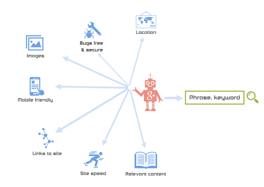
Google search engine algorithm at work.

    More about April 21 update

    This time the Google algorithm update is all about mobile. No wonder, almost 30% of global internet traffic is from mobile devices and mobile share is growing fast. Google partially revealed what will be taken into account while checking for mobile-readiness. All those things are centered around usability:

    How fast the page opens on often limited mobile connections, is the website usable without zooming and scrolling horizontally, are all links made the way it is easy to click on them with your finger, does the site use technology that mobiles are not able to display (for example flash) etc. In other words, the algorithm will check all the things that most mobile users find annoying and it will assign your site a score. What impact will this mobile score have on the overall page rank is still unknown, but we can guess it will be important as Google went as far as issuing an official statement warning about those changes (Statement on official Google blog).

    How does it concern me?

    What it means for website owners is that they hard worked position in search results will start falling if their site is doesn’t meet the new criteria. Worse search results mean less visits, less clients and less conversions. Nobody can afford that. Most probably, your site or shop won’t loose its position from one day to another, but it will rather start slowly falling to the bottom. But while getting demoted in search results is easy, going up is really difficult. Of course you can always just ignore Google new algorithm and suggestions, but it is just a matter of time that you will be struck hard. Like we mentioned above, more and more people use mobiles to browse internet and while it is true that potentially they could view many NON-mobile ready pages by horizontal scrolling and zooming, in fact they are not very likely to do that because they simply find it annoying and time-consuming. Most users prefer purchasing from mobile-friendly sites and in most cases there is always some competitor that is offering this possibility. So sooner or later you will start loosing clients if you don’t adapt to new technology.

    As for the solution, depending on how well your site is designed and maintained (updated), you would need either small fixes or to have your whole web redesigned to align with those demands.

    How would I know if my site is mobile friendly?

    If you are unsure about whether your page is or is not mobile ready, Google has provided a tool to do that.

    Google is your site ombile friendly test

    Google mobile-friendliness check tool in action

    In a clear way it will show you if your site is adapted to mobiles and what it’s lacking. If you are in green just like us then it is all OK. But if you are in yellow or red there are things you need to change.

    You can also get our free web page analysis and check your page in more details to see what changes does it need.

    The new design

    If a new design is the only option for your site / shop, the best practice is to make sure it will adapt to most of future devices without a hassle, using Responsive Design.

    So don’t loose your time, don’t risk your position. Check your website and start preparing for a new design for you website. You should always try to be ahead of the competition anyway!

    And dont forget to apply for free web page analysis :)


    Update – 27 MArch 2015
    Google hosted a Hangout few days ago to explain in more details some of the aspects of its new mobile friendly algorithm.
    See our follow up on this topic

  • - THE END -
  • Opencart – fixing “Notice: Error: RCPT TO not accepted from server!” (VQMOD)

    This is a patch to fix problems with sending contact form in Opencart 1.5 and 2.0.

    If you get the following (or similar) message:

    Notice: Error: RCPT TO not accepted from server! in system/library/mail.php on line 308

    in your Opencart installation, be it v 1.5.x or 2.0.x, then probably your email provider has SPF policy (Sender Policy Framework) verifying the so-called FROM address. This is a good thing, it means that your email provider has a properly configured server that protects from spam messages and other improper uses.
    With SPF policy, you cannot put anything you want in the FROM field, it needs to match your account address or at least your email domain.
    In other words, if your email address for the shop is, let’s say, moc.niamodruoy@pohs, it will probably only allow moc.niamodruoy@pohs as a sender address or in the best case scenario moc.niamodruoy@GNIHTYNA.

    Opencart Contact Form

    The error listed above is caused by the fact that OpenCart for some reason is using another approach. In OpenCart solution, the email address that your client is putting in the contact form is automatically assigned by the OpenCart system as the FROM field of the message. It means that the contact form message is forcefully interpreted as a message coming from your client’s email account (which is not the case, your client is not sending this message from his email account, he only gives you his email address so that you can reply to him).This means that a properly configured server will not send such a message and your client will not be able to contact you.

    So should you ask your email account provider to change this SPF or whatsoever setting so that you’re able to use OpenCart way of doing things?

    Well, there is a slight problem with this solution. Most providers won’t change their SPF policy. And they are right. Their approach is 100% correct according to email configuration standards (see RFC 4408 http://www.ietf.org/rfc/rfc4408.txt ). It is also a good practice when fighting spammers.

    That is the right solution, then?

    The best thing to do is to modify your OpenCart emailing library to make it act properly :)

    This is really easy as you only need to change just a few lines of code in 2 files.

    If you don’t feel like doing it on your own, I have written simple vqmods that will do the same thing for you. If you don’t have Vqmod installed or you don’t want to install it just follow the steps in those two tutorials for OpenCart 1.5 and 2.x

    ***UPDATE 08-06-2015
    Version 0.2.1 of our module released
    – Fixed Reply-to bug when receiving new order alerts (Thanks to Fayez Saidawi for pointing this out)

    ***UPDATE 13-02-2015
    Version 0.2 of our module released
    – Added field in Mail tab that lets you configure smtp account for sending mails independently from your store main email
    – All emails from contact forms and notifications will be send to main store email


    You can download our mods here:

    Opencart 1.5 – Contact form sending problems with smtp account fix
    Opencart 2.0 – Contact form sending problems with smtp account fix

    Installation

    Unzip those files and copy them to vqmod/xml folder in your store main directory. Thats it!

    Configuration

    Those modules will use SMTP Email Address as the FROM field. So make sure that this field is the same as the account you set in email tab in your shop settings(just as on the picutre below).

    The emails will be send to your main shop email (set in Email field in Store tab).

    Opencart admin

    If you have any problems with installing those modules or you need professional help with customizing your OpenCart

    Contact us for a free consultation or quote

  • - THE END -
  • Mobile ready webdesign

    Do I really need a mobile ready web page? And what does it really mean?

    Lately there has been a lot of fuss about mobile friendly/mobile ready web pages, mobile internet usage and similar stuff. Why is that the case and should we even care? To put it simply, mobile and tablet users are growing in numbers rapidly, very rapidly. And this growth implies changes, as mobile users see and browse pages differently than desktop users do (and tablet users do it in a different way, too). So we definitely should care, and I’ll try to explain why.

    Let’s take a look at the mobile (and tablet) internet usage statisitics:

    whyresponsive1

    Just a word on tablets, the prognostics for tablet growth are really amazing. Many analitics are pointing out that tablets will replace desktops almost completely in the future. While this is uncertain, the sure thing is that tablets and mobile users are social groups that are experiencing a very dynamic growth.

    So what do these statistics mean? They simply mean that the internet world is now changing in a way that challenges our previous designs and solutions. 1/4 of internet traffic is performed on devices with small screen sizes, without any mouse or keyboard, and with a touch screen. What’s more, almost all your potential clients move continously from one device to another, and thus there are no fixed device characteristics, there are no fixed screen widths and there are no fixed habits that could fit all of those devices. You browse differently while using a small touch screen without a mouse than while using a 30” screen with mouse and keybord attached. You would also expect other things on those small devices like links and buttons to be bigger so you could hit it easily with your fingers etc. The key term here would be flexibility. That’s what we need.

    We could of course do nothing and keep our web page focused on desktops. But are we sure we can afford to lose at least 25% of our potential clients? (If not more, because some webpages don’t look good on modern huge TV or screens either). As business owners, we want to do something to make them use our services or buy our products. And we can only achieve this by making their experience more fluent and pleasant, by better adapting to their needs. But it may turn out difficult as you need to adapt to a constanly changing environment, with very few static variables.

    So how we should address this problem?

    A word about responsive design

    There are basically 2 approaches regarding the issue of adapting your web page to different devices.

    Some companies and designers have opted to make 2 or even 3 versions of a web site: one for desktops, one for mobiles and one for tablets. Well, this approach doesn’t make much sense nowadays. They are fixed for just a few screen sizes and a few devices. So if a new tablet or smart phone appears on the market with another innovative characteristics, those sites will most likely no longer work as they were supposed to. The only solution in that case would be to make another web page version or even change the design completely. And that is costly and time consuming.

    The second approach is called responsive design. It is a design that adapts automatically (or almost automatically) and accordingly to user’s screen size. So if a new type of device emerges you can be pretty sure that it will support it right out of the box. And if not, you will be able to make it this-new-device friendly with just minor adjustments.

    Responsive design also makes it possible to tweak the webpage only for a specific segment (for example smartphones, tablets, or wide screens) to make user experience better and to make the shopping process for those devices easier (taking into account that each device segment has its habits and advantages etc.).

    Responsive design has its downsides, too. Sometimes you need to sacrifice some parts of your design (that otherwise wouldn’t display properly on mobiles for example) and there is an issue related with pages opening slower on mobiles (a way to overcome this is to use server side mobile optimalization – but this is material fo another post). However, in the long run, it is cheaper to maintain and it will adapt better to new devices and screen resolutions yet to come than the first approach. The hassle and costs will pay off with time.

    That’s why in most cases, in terms of being user fiendly (whichever device we’re talking about), the responsive design is the best choice as for now. Unless of course somebody invents an even better way of making websites in the future. Such possibility always exists, you know:)

    To sum up, if we don’t want to loose our position on the online market, or if we cherish the popularity of our blog, we should doubtlessly undertake some steps, as more and more people will start using mobile devices in the near future, and the best solution so far seems to be responsive design. We better not think it too long, the time is now.

  • - THE END -
  • Opencart – fixing “Notice: Error: RCPT TO not accepted from server!” (tutorial)

    This is a patch to fix problems with sending contact form in Opencart 1.5 and 2.0.

    If you get the following message:

    Notice: Error: RCPT TO not accepted from server! in system/library/mail.php on line 308

    in your Opencart installation, be it v 1.5.x or 2.0.x, then probably your email provider has SPF policy (Sender Policy Framework) verifying the so-called FROM address. This is a good thing, it means that your email provider has a properly configured server that protects from spam messages and other improper uses.
    With SPF policy, you cannot put anything you want in the FROM field, it needs to match your account address or at least your email domain.
    In other words, if your email address for the shop is, let’s say, moc.niamodruoy@pohs, it will probably only allow moc.niamodruoy@pohs as a sender address or in the best case scenario moc.niamodruoy@GNIHTYNA

    Opencart RCPT TO not accepted fix

    The error listed above is caused by the fact that OpenCart for some reason is using another approach. In OpenCart solution, the email address that your client is putting in the contact form is automatically assigned by the OpenCart system as the FROM field of the message. It means that the contact form message is forcefully interpreted as a message coming from your client’s email account (which is not the case, your client is not sending this message from his email account, he only gives you his email address so that you can reply to him).This means that a properly configured server will not send such a message and your client will not be able to contact you.

    So should you ask your email account provider to change this SPF or whatsoever setting so that you’re able to use OpenCart way of doing things?

    Well, there is a slight problem with this solution. Most providers won’t change their SPF policy.
    And they are right. Their approach is 100% correct according to email configuration standards (see RFC 4408 http://www.ietf.org/rfc/rfc4408.txt). It is also a good practice when fighting spammers.

    What is the right solution, then?

    The best thing to do is to modify your OpenCart emailing library to make it act properly :)

    This is really easy as you only need to change just a few lines of code in 2 files.

    Below you have 2 tutorials how to change it for OC 1.5 and 2.0 versions. If you don’t feel like doing it on your own, I have written simple vqmods that will do the same thing for you. You can download them hereNotice: Error: RCPT TO not accepted from server! – fix (VQMOD)
    If you don’t have Vqmod installed or you don’t want to install it just follow the steps in the tutorials.

    Opencart 1.5 Fix

    1. First edit the file catalog/controller/information/contact.php
      Look for line:

      $mail->setFrom($this->request->post['email']);
      in my version it is line 20
      Change it to:
      $mail->setFrom($this->config->get('config_email'));

      What this will do is set the FROM field to be the same as your shop’s main email address.
      You can hardcode (but I wouldn’t recommend it) an email adress here if you want by changing this line to ie:
      $mail->setFrom('shop@mydomain.com');

    2. Now find the line:

      $mail->setSender($this->request->post['name']);
      It should be below the line we just edited or somwhere near.
      Change it to:
      $mail->setReplyTo($this->request->post['email']);
      $mail->setSender($this->config->get('config_email'));
      What this will do is set your client’s email provided by him in the contact form as reply-to email, so that you’re able to respond automatically to contact form messages by clicking on Reply button.
      It is also setting your shop email address as sender’s name.

    3. OK so now we need to edit system/library/mail.php file
      In the beginning you will have line:
      protected $subject; 
      Just add this before it:
      protected $replyto;
      Find line:
      public function setSender($sender) { 
      and before it add:
      public function setReplyTo($reply_to) {
      $this->replyto = html_entity_decode($reply_to, ENT_QUOTES, 'UTF-8');}
      What we did here is to add REPLY-TO function which is missing in 1.5 (but is present in 2.0) and allows us to set different reply-to addresses than FROM address.
    4. Finally find this line:
      $header .= 'Reply-To: ' . '=?UTF-8?B?' . base64_encode($this->sender) . '?=' . ' <' . $this->from . '>' . $this->newline;
      and change it to:
      if ($this->replyto){
      $header .= 'Reply-To: =?UTF-8?B?' . base64_encode($this->replyto) . '?=' . ' <' . $this->replyto . '>' . $this->newline;
      }
      Here we are correcting the way reply-to address is set (it will use the email address your client introduced in the contact form).
      And that’s it!

    If you have any problems with OC and need professional help or support

    Contact us for a free consultation or quote

    Opencart 2.0 fix

    It is simplier to change in the newest version of OC because there is already a funciton to set Reply-To address.

    1. First edit the file catalog/controller/information/contact.php
      Look for line:
      $mail->setFrom($this->request->post['email']);in my version it is line 20
      Change it to:
      $mail->setFrom($this->config->get('config_email'));
      What this will do is set the FROM field to be the same as your shop’s main email address.
      You can hardcode (but I wouldn’t recommend it) an email adress here if you want by changing this line to ie:
      $mail->setFrom('shop@mydomain.com');
    2. Now find this line:
      $mail->setSender($this->request->post['name']); 
      It should be below the line we just edited or somwhere around.
      Change it to:
      $mail->setReplyTo($this->request->post['email']);
      $mail->setSender($this->config->get('config_email'));
      What this will do is set your client’s email provided by him in the contact form as reply-to email, so that you’re able to respond automatically to contact form messages by clicking on Reply button.
      It is also setting your shop email address as sender’s name.
    3. Now we need to edit system/library/mail.php file
      You just need to change this line:
      $header .= 'Reply-To: =?UTF-8?B?' . base64_encode($this->replyto) . '?=' . ' <' . $this->from . '>' . $this->newline;
      change it to:
      $header .= 'Reply-To: =?UTF-8?B?' . base64_encode($this->replyto) . '?=' . ' <' . $this->replyto . '>' . $this->newline;
      Here we are correcting the way reply-to address is set (it will use the email address your client introduced in the contact form).
    4. And this line to correct annoying bug with Reply-to being not set correctly when notifying customer about new order:
      $this->setReplyTo($this->sender);
      Replace it with this:
      $this->setReplyTo($this->from);
      Refresh your contact form and try sending a test email.

    If you have any problems with OpenCart and need professional help or support

    Contact us for a free consultation or quote

  • - THE END -