
Do I really need a mobile ready web page? And what does it really mean?
Lately there has been a lot of fuss about mobile friendly/mobile ready web pages, mobile internet usage and similar stuff. Why is that the case and should we even care? To put it simply, mobile and tablet users are growing in numbers rapidly, very rapidly. And this growth implies changes, as mobile users see and browse pages differently than desktop users do (and tablet users do it in a different way, too). So we definitely should care, and I’ll try to explain why.
Let’s take a look at the mobile (and tablet) internet usage statisitics:
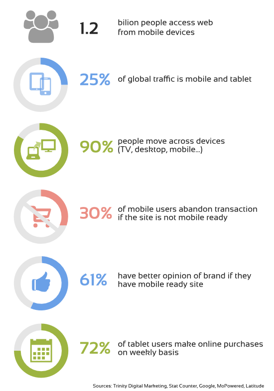
Just a word on tablets, the prognostics for tablet growth are really amazing. Many analitics are pointing out that tablets will replace desktops almost completely in the future. While this is uncertain, the sure thing is that tablets and mobile users are social groups that are experiencing a very dynamic growth.
So what do these statistics mean? They simply mean that the internet world is now changing in a way that challenges our previous designs and solutions. 1/4 of internet traffic is performed on devices with small screen sizes, without any mouse or keyboard, and with a touch screen. What’s more, almost all your potential clients move continously from one device to another, and thus there are no fixed device characteristics, there are no fixed screen widths and there are no fixed habits that could fit all of those devices. You browse differently while using a small touch screen without a mouse than while using a 30” screen with mouse and keybord attached. You would also expect other things on those small devices like links and buttons to be bigger so you could hit it easily with your fingers etc. The key term here would be flexibility. That’s what we need.
We could of course do nothing and keep our web page focused on desktops. But are we sure we can afford to lose at least 25% of our potential clients? (If not more, because some webpages don’t look good on modern huge TV or screens either). As business owners, we want to do something to make them use our services or buy our products. And we can only achieve this by making their experience more fluent and pleasant, by better adapting to their needs. But it may turn out difficult as you need to adapt to a constanly changing environment, with very few static variables.
So how we should address this problem?
A word about responsive design
There are basically 2 approaches regarding the issue of adapting your web page to different devices.
Some companies and designers have opted to make 2 or even 3 versions of a web site: one for desktops, one for mobiles and one for tablets. Well, this approach doesn’t make much sense nowadays. They are fixed for just a few screen sizes and a few devices. So if a new tablet or smart phone appears on the market with another innovative characteristics, those sites will most likely no longer work as they were supposed to. The only solution in that case would be to make another web page version or even change the design completely. And that is costly and time consuming.
The second approach is called responsive design. It is a design that adapts automatically (or almost automatically) and accordingly to user’s screen size. So if a new type of device emerges you can be pretty sure that it will support it right out of the box. And if not, you will be able to make it this-new-device friendly with just minor adjustments.
Responsive design also makes it possible to tweak the webpage only for a specific segment (for example smartphones, tablets, or wide screens) to make user experience better and to make the shopping process for those devices easier (taking into account that each device segment has its habits and advantages etc.).
Responsive design has its downsides, too. Sometimes you need to sacrifice some parts of your design (that otherwise wouldn’t display properly on mobiles for example) and there is an issue related with pages opening slower on mobiles (a way to overcome this is to use server side mobile optimalization – but this is material fo another post). However, in the long run, it is cheaper to maintain and it will adapt better to new devices and screen resolutions yet to come than the first approach. The hassle and costs will pay off with time.
That’s why in most cases, in terms of being user fiendly (whichever device we’re talking about), the responsive design is the best choice as for now. Unless of course somebody invents an even better way of making websites in the future. Such possibility always exists, you know:)
To sum up, if we don’t want to loose our position on the online market, or if we cherish the popularity of our blog, we should doubtlessly undertake some steps, as more and more people will start using mobile devices in the near future, and the best solution so far seems to be responsive design. We better not think it too long, the time is now.