Redmarlin - Blog

Category: Web design
  • Mobile design and Google search results

    Being mobile ready can affect positively your SEO

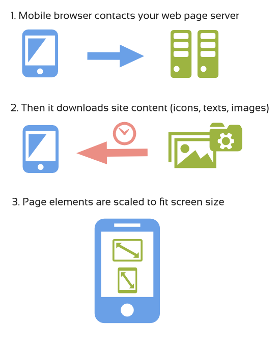
    The mobile web market is growing amazingly fast and website owners try to go ahead and adapt their sites for mobile users. But in the near future being mobile reday won’t mean being ahead, it will be simply essential for your web presence. Well, in fact it is already happening, you don’t have to wait for the future. Mostly because you need to be able to serve new customers, but there is also another aspect of being mobile friendly which is often overlooked and can be crucial for your bussines. Being mobile friendly directly affects your position in Google searches (SEO).

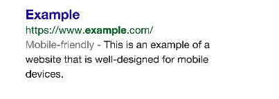
    In November 2014 Google announced that it will add a special tag to all websites adapted to mobiles, a “Mobile-friendly” label.

    Google Official Blog

    Google mobile search Source: Google Official Blog

    But that’s not all, Google is experimenting with using mobile-friendly criteria to rank your site. In other words, being mobile-friendly will affect your google search ranking.

    According to Google, a webpage is eligible for this label if it meets the following requirements:

    -” Avoids software that is not common on mobile devices, like Flash”

    – “Uses text that is readable without zooming”

    – “Sizes content to the screen so users don’t have to scroll horizontally or zoom”

    – “Places links far enough apart so that the correct one can be easily tapped”

    Google also provides site owners with a tool where you can check if your site is currently meeting those conditions.

    Google Mobile-Frinedly Test

    Google Optimization tool

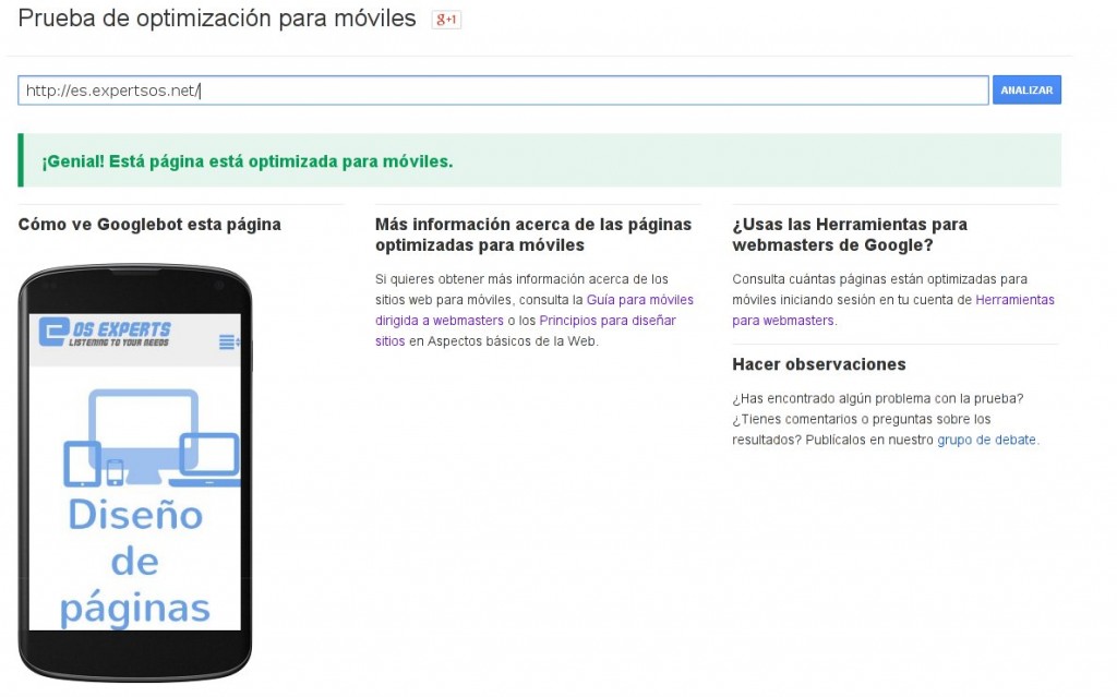
    If your site is mobile friendly then you will see green texts saying everything is OK*like on the pic above). If not you will receive some tips how to make your site better.

    The speed IS important

    There are many articles stressing the importance of speed in web design, especially in mobile world. Google also takes that into account (this mechanism is already implemented into Google algorythm) in its ranking mechanism. Pages that open faster and are better optimized will score higher in Google searches.

    Again, there is a tool from Google to check how your page is doing in terms of optimization, user experience and speed. It is a good thing to score high, but you don’t need to worry too much about all the tips and fixes proposed by Google. Those certainly will make your site Google bot friendly but it will sometimes hinder the user experience which is by far the most important thing.

    Google mobile ready test

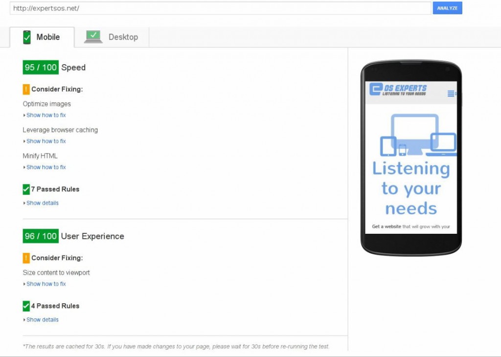
    As a general rule, it is good to score in green range of points (aprox. 90 out of 100) to make sure it will affect your GOOGLE SEO positively.

    Google Speed Insights

    Also it is a good habit to compare Google test results with other tools of this type, just to name a few that are the most usefull:

    Pingdom
    Web Page Test
    GT Metrix

    Choose your developer carefully

    I will use a short Google article about making better mobile ready websites as a pretext to highlight 2 important aspects of web designing. One of those articles has 6 pieces of advice for finding a good developer to ensure high quality and mobile readiness of a site.

    What should I think about when working with a developer – by GOOGLE

    Most of the tips are nothing new and are really common sense, like: make sure to hire a developer with experience in mobile web design, make sure he understands mobile world, make him install measurement and analitics tools etc.

    But there are two points that are the most important. Google doesn’t enter deep into the subject so I would like to explain those 2 concepts mentioned by Google a little bit more (points 3 and 6 of the above-linked article).

    Google developer guides Source: Google Site Insights

    Web page speed is crucial, not only for your SEO ranking.

    Developers are often so concerned about the design, look and feel of the pagethat they tend to completely forget that SPEED is a very important part of user experience. If the page doesn’t open fast enough, all those bells and whistles won’t serve their purpose. The visitor, discouraged by how slow the site opens, will leave even before trying or seeing them.

    So yes, speed is important and make sure that the team your are hiring not only has a developer who can make fast and optimalized web apps, but also a good sysadmin that can tune the server to ensure a maximum performance for this specific web page.

    The site is not a finished product, it needs to evolve constantly.

    While speeding up the websites is gaining more and more supporters and many articles have been written about it recently, this aspect remains rather unknown to the general public. In a world where technology changes so quickly, there is no such thing as 100% complete/finished web page. A web page is not a book that, once finished, you can put on display and forget about it. Websites need to be constantly adapted to changing technologies, user needs and expectations.

    That’s why it is important to listen to your customers and analize web page statistics. You should CONsTANTLY IMPROVE your web page in order to deliver the best experience possible. Don’t forget that in many cases your company’s web page is the first encounter point for your clients. They will get to know you by your web page, they will judge your bussines by how your page works and how it looks.

    Besides, manitaining and upgrading web pages on a regular basis makes it easier, faster and less expensive to adapt to a constantly changing world. It is better to give one small step at a time than to have rebuild your web site every few years from scratch, and it gives you a website that is always up-to-date, not only every now and then.

    Listening and taking your clients’ feedback into account will not only let you make the web page a better experience for them, discover their needs or anticipate the market demand, it will also cause you’ll be closer to your customers, it will help engage with them and build a community around your business.

    To sum up, being mobile friendly is a must-be for any company now, as not only will it reach customers using mobile devices but it will also add “points” to your Google search ranking. Besides, being mobile means being FAST – optimizing your site for speed is as important as having great responsive design, or even more important. You also should not forget that a website is not a finished product and it should constantly evolve to match your client changing preferences.

    If you need a mobile friendly website/online store that is optimized for speed Contact us for a free quote

    What’s more, it looks like our own philosophy of constantly growing websites matches perfectly Google tips for site owners!

  • - THE END -
  • Responsive design optimization

    Is my site really mobile ready?

    Amidst all this technological turmoil, many people tend to think, “well, I have my responsive web page finished, so I guess I am mobile ready?” Well, probably not yet. The thing is, most designers forget about one “small” detail – performance. Usually, the biggest flaw of responsive design is its speed. Here goes an attempt to explain this aspect without entering too much into tech details.

    In responsive design, you scale elements (including images) on browser screen to match users device size. But this doesn’t mean you actually make big image any smaller. What this scaling does (the scaling is mostly done in CSS) is to take the original image and tell the browser to show it as a smaller image. What it means is:

    optimalize1

    This way, if you have a big image to match large desktop screen, this image will be loaded by mobile devices also, it will just appear smaller. The bigger the image, the slower it will take to load it. And on mobile devices it will make even longer, as those normally have much slower internet connection than your laptop or desktop pc. Apart form images, there are lots of other elements that are loaded to make the page look nice. Those elements are sometimes hidden by responsive design for smaller screens because they are not needed or they just use too much screen. But like with images, they are still loaded by mobile users, even if they are not displayed.

    Well nobody likes to wait, so if the visitors are forced to wait too long, they will probably leave the site. Also, if the site is too big while having many visitors per hour, it may significantly slower your server, and consequently your web page, even more. In other words, websites that suppose to be mobile friendly don’t serve their purpose if they load too long. Optimization for speed is a must-be in the small screen size world.

    Is there anything we can do about it?

    The answer is, of course, yes. There are a few ways to optimize responsive design pages. Apart of course from doing nothing (which is sadly the most common approach).

    There are also some basic things you should always do independently whether you deal with responsive designs or not.

    • Compress all your images so that their size will decrease, which means loading faster and using less server bandwidth.Use services like:
      Compressor.io
      Kraken.io

    • Think whether you really need all of those bells and whistles, turn off all those functionalities you don’t need or you don’t use right now.

    • Use plugins for your CMS or online shop that will optimize your content. Normally what they do is to compress content they send to visitors so that it takes less to send it. They also cache content (save most used parts of your web page and serves it in more efficient way). There are many of them available for any platform. Just to name few plugins for WP: APC, W3 Total Cache or WP Super Cache

    There are also some more advanced techniques to optimize your web page. All of them have one thing in common: detecting visitors screen size and serving resized(smaller) and optimized images for this screen. As it usually happens, most of those solutions are not perfect. So the best approach is to use multilevel optimization or mixed techniques to get a final effect as foolproof as possible.

    Just before ordering your web page, make sure that your designer understands the need of optimization or – even better – that the company you hire has a server administrator capable of tuning your server and website for faster mobile experience.

    Advanced responsive design optimization solutions.

    If you are not scared of technical details I will name 3 mainly used methods of advanced responsive design optimization.

    • Javascript optimization.
      This will use some special written code (javascript) to detect visitors settings and then on the fly overrides big images with their smaller versions.
      While it can detect various different settings, this approach sometimes tends to fail to optimize anything. Because modern browsers fetch images before they execute java scripts, chances are that you will force visitors to download the same image twice (first the big version and then the small version), this is not what we really want, is it?
      There are many new variations of this method appearing that try to address the problem, so these solutions are starting to work better, but still they are fair less effective than server side optimization. The biggest advantages of this solution are easiness of implementation and possibility of detecting many other settings than just screen size.

    • Server side optimization.
      This will use special server configuration to detect the browser version of the visitor and see if this is mobile, tablet or desktop. Then it directly serves appropriate version of the image. This method is very fast and the gains in performance are really big but it fails to detect many devices and you need to constantly add new browser versions. Also it is unable to detect visitors screen sizes. It can only detect if its mobile, tablet or desktop and even here it can fail sometimes.
      (Well, to be honest. there are high-end server detection systems with device database constantly updated but they are very expensive and are normally directed to corporations or big companies). So this approach will require deep server knowledge and thus it will be more expensive to setup and maintain. But this is the option that gives the highest speed increments.

    • The best of the two worlds.
      This approach mixes the js detection possibilities with server side optimization. Basically, the javascript is responsible for detecting the screen size and then communicating it to the server (using special cookie), the server then recognizes the cookie and serves images accordingly to the screen size. It also has a fail-safe mechanism: if by some reason the cookie is not set fast enough for the server to react, there is a server level device detection (although not perfect, it will be enough as a backup mechanism) and will try to serve image accordingly to the system detected (mobile, desktop or tablet).
      This will give you both the flexibility of visitors settings you can detect and the speed of server side optimization.
      Of course, even this system can sometimes fail to detect the visitor’s screen size accurately, but because of the double check the chances are much smaller.
      You would still need a system administrator to setup the server for this solution and you’d have some maintenance costs, but those would be lower than in case of pure server side optimization.

    By far this third option is the best solution to implement, and the most cost effective.

    To sum up

    Responsive design is a must-have these days, but only if properly set up. Choose the option that is best for you and make sure your designer understands this issue and takes it seriously.

  • - THE END -
  • Mobile ready webdesign

    Do I really need a mobile ready web page? And what does it really mean?

    Lately there has been a lot of fuss about mobile friendly/mobile ready web pages, mobile internet usage and similar stuff. Why is that the case and should we even care? To put it simply, mobile and tablet users are growing in numbers rapidly, very rapidly. And this growth implies changes, as mobile users see and browse pages differently than desktop users do (and tablet users do it in a different way, too). So we definitely should care, and I’ll try to explain why.

    Let’s take a look at the mobile (and tablet) internet usage statisitics:

    whyresponsive1

    Just a word on tablets, the prognostics for tablet growth are really amazing. Many analitics are pointing out that tablets will replace desktops almost completely in the future. While this is uncertain, the sure thing is that tablets and mobile users are social groups that are experiencing a very dynamic growth.

    So what do these statistics mean? They simply mean that the internet world is now changing in a way that challenges our previous designs and solutions. 1/4 of internet traffic is performed on devices with small screen sizes, without any mouse or keyboard, and with a touch screen. What’s more, almost all your potential clients move continously from one device to another, and thus there are no fixed device characteristics, there are no fixed screen widths and there are no fixed habits that could fit all of those devices. You browse differently while using a small touch screen without a mouse than while using a 30” screen with mouse and keybord attached. You would also expect other things on those small devices like links and buttons to be bigger so you could hit it easily with your fingers etc. The key term here would be flexibility. That’s what we need.

    We could of course do nothing and keep our web page focused on desktops. But are we sure we can afford to lose at least 25% of our potential clients? (If not more, because some webpages don’t look good on modern huge TV or screens either). As business owners, we want to do something to make them use our services or buy our products. And we can only achieve this by making their experience more fluent and pleasant, by better adapting to their needs. But it may turn out difficult as you need to adapt to a constanly changing environment, with very few static variables.

    So how we should address this problem?

    A word about responsive design

    There are basically 2 approaches regarding the issue of adapting your web page to different devices.

    Some companies and designers have opted to make 2 or even 3 versions of a web site: one for desktops, one for mobiles and one for tablets. Well, this approach doesn’t make much sense nowadays. They are fixed for just a few screen sizes and a few devices. So if a new tablet or smart phone appears on the market with another innovative characteristics, those sites will most likely no longer work as they were supposed to. The only solution in that case would be to make another web page version or even change the design completely. And that is costly and time consuming.

    The second approach is called responsive design. It is a design that adapts automatically (or almost automatically) and accordingly to user’s screen size. So if a new type of device emerges you can be pretty sure that it will support it right out of the box. And if not, you will be able to make it this-new-device friendly with just minor adjustments.

    Responsive design also makes it possible to tweak the webpage only for a specific segment (for example smartphones, tablets, or wide screens) to make user experience better and to make the shopping process for those devices easier (taking into account that each device segment has its habits and advantages etc.).

    Responsive design has its downsides, too. Sometimes you need to sacrifice some parts of your design (that otherwise wouldn’t display properly on mobiles for example) and there is an issue related with pages opening slower on mobiles (a way to overcome this is to use server side mobile optimalization – but this is material fo another post). However, in the long run, it is cheaper to maintain and it will adapt better to new devices and screen resolutions yet to come than the first approach. The hassle and costs will pay off with time.

    That’s why in most cases, in terms of being user fiendly (whichever device we’re talking about), the responsive design is the best choice as for now. Unless of course somebody invents an even better way of making websites in the future. Such possibility always exists, you know:)

    To sum up, if we don’t want to loose our position on the online market, or if we cherish the popularity of our blog, we should doubtlessly undertake some steps, as more and more people will start using mobile devices in the near future, and the best solution so far seems to be responsive design. We better not think it too long, the time is now.

  • - THE END -